Lunatask, a strong but crazy new entrant into productivity?

I try a lot of new productivity apps, and very seldom do I play with one for more than 5 minutes. They all kinda look the same and are repackaging the same features. That’s why I was so surprised when I tried Lunatask… there’s a lot of interesting stuff going on… most good, some bad.
Up Next / Later / Now
The first thing that caught my eye was how luna tasks are organized; Now / Started / Waiting / Later. My current task manager (Things 3) uses more of a Today / Upcoming / Anytime / Someday layout. The issue with the Things layout is that it’s heavily based on giving your tasks specific dates. For example, to show up in upcoming, you need to assign the date a task. I’m terrible at predicting dates for my tasks, so it’s created a bunch of friction in my use of the tool.
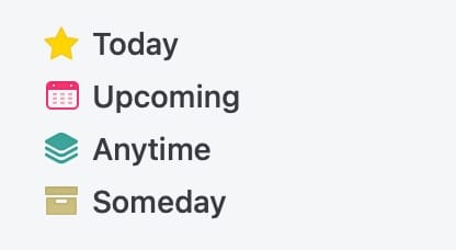
Lunatask uses a Now / Later / Next type structure that also has options for “starting” and “waiting” on. This mirrors my brains way of thinking about work better than the method in things, it effectively reduces the need for specific dates.
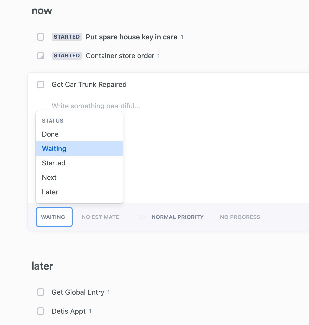
Ideally I’d like 3 clear stages. Now, things I’m working on today. Up Next, the things that are ready to work on and could be easily pulled into “now”. And then everything else, which could be in “later”. I’ll have to play with the Lunatask tools to see if I can get to my dream stages, but for now this is a very promising start.
Progress, Priorities, Pins
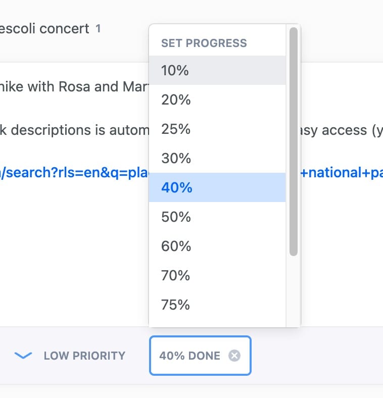
On top of the stages above, Lunatask also gives you the power to prioritize, indicate progress, and to “pin” your tasks. These features stay out of the way, so it doesn’t come at a huge cost in terms of cluttered UI.
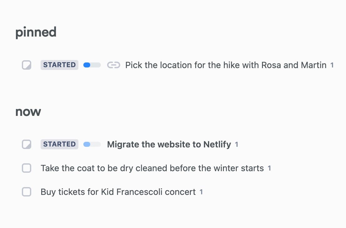
I sometimes have a top priority task that needs to hover over everything else, so I could see Pinning that to the top for a day or two until I get it done. I also have tasks that linger and take a while, so having a clear “in progress” tag for projects that could take longer would be useful.
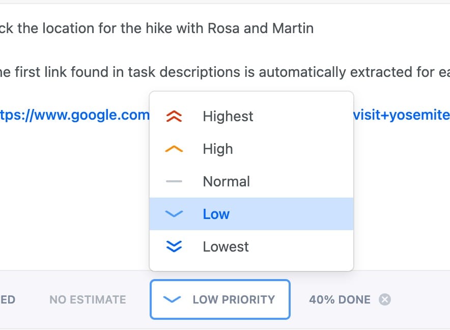
Workflows
I didn’t pay for the premium version, but from this drop down it looks like you can choose what type of organizational view you want to have for your tasks. This is a bit reminiscent of Asana, but it seems cleaner and more practical to me.
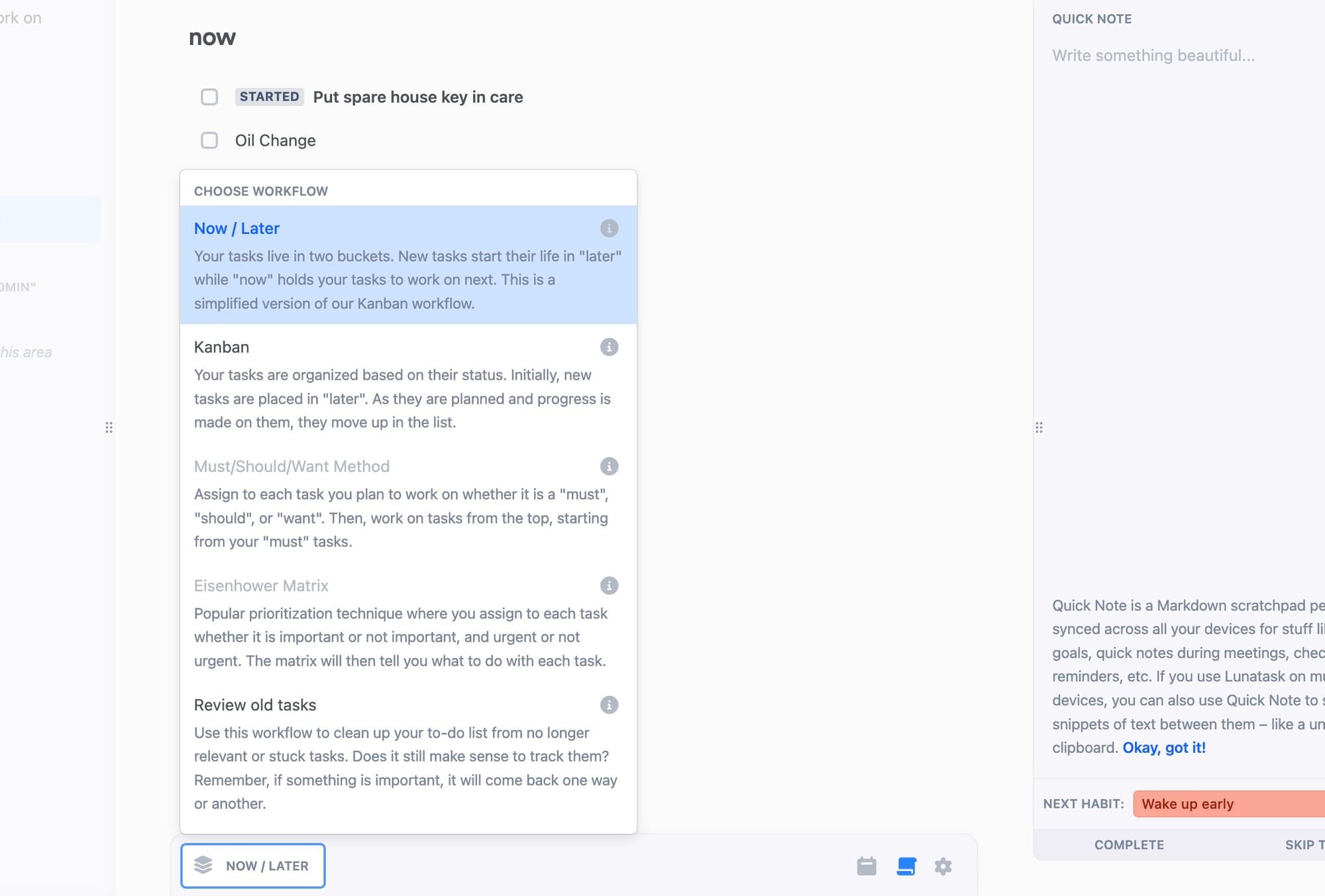
I could see certain areas being a Kanban view, and other areas I could see using the must / should / want view. In my current workflow, I use Things for most task management, but I use things like Notion to organize my YouTube content because I can use a kanban view. This could help me cut down on the number of tools I’m using, and keep me from jumping all over the place.
All-in-one = All-in-none?
I’m really impressed with just the task section of this app. I think it’s better than 80% of the task apps Ive tried, and I’ve probably been trying 1 or 2 apps a month for 10 years. What’s crazy is that this team has attempted to take on WAY more than tasks; journaling , habit tracking, notes, and eventually Personal CRM.
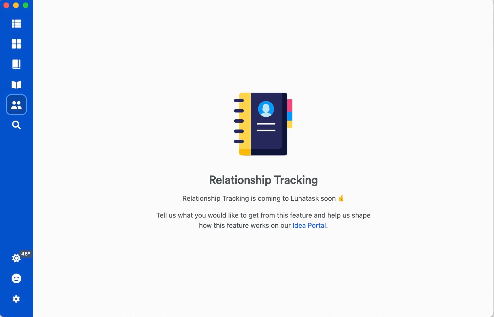
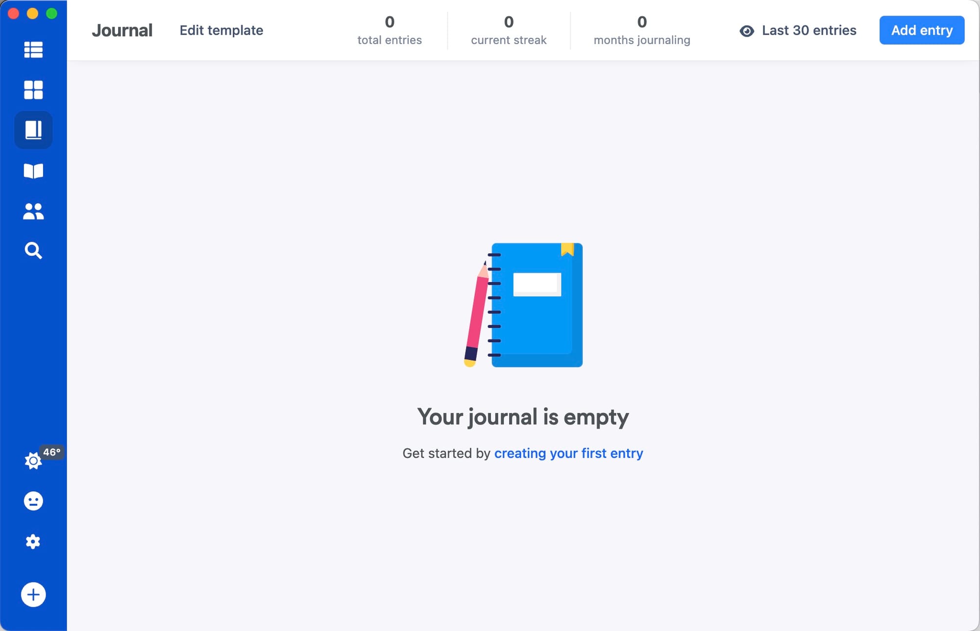
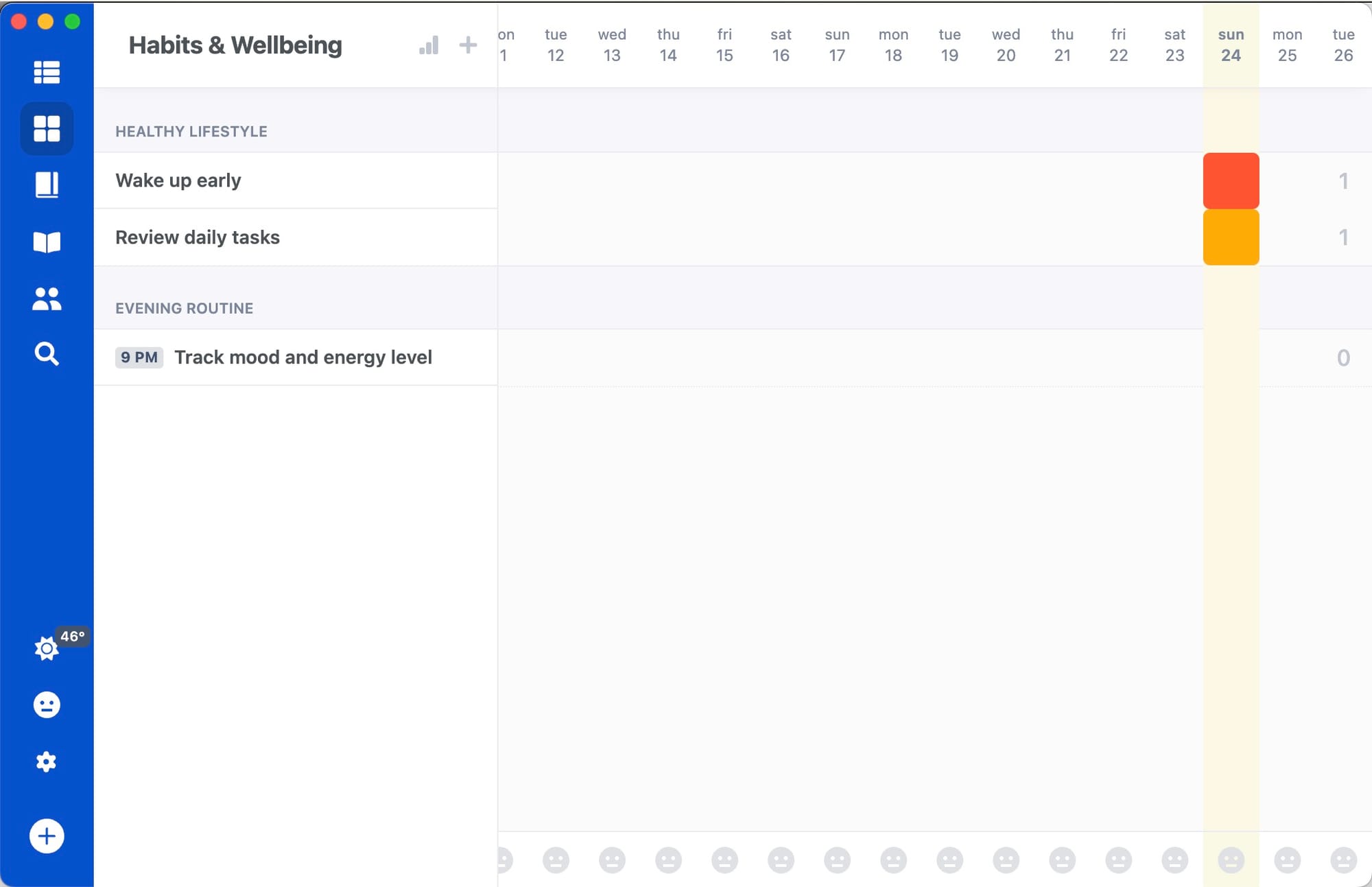
This throws up immediate red flags. Most apps that try to do more than one or two things, end up doing them poorly. Clearly this team has some talent, I’d be horrified if instead of getting the best task / calendar / notes app we’ve ever seen, we end up getting a mediocre app that tries to do everything.
Don’t get me wrong, I use a notes app, a journaling app, a habit tracker, and I’ve been looking for a PRM. These aren’t bad choices. Habit tracking in particular is a form of tasks, so I hate that it’s currently its own app. Journaling is also a subset of notes, and even though I’m happy with Day One, I could see using this instead.
I probably would have chosen Calendar / Notes / Tasks first before trying to tackle some of these other ones, but we’ll see. This is an app to watch for sure.
My Wish list
No heavily opinionated post on task management apps would be complete without an impossible wish list. Here’s what I would need to ditch my task and notes app.
- Native iOS apps with swipe to indent or outdent.
- Notes and tasks need to be able to have images in them, and preferably I’d like to be able to format them very quickly to make them more viewable (craft auto formats multiple images into gallery-esque layouts that make visual note takers very very happy).
- Ability to link from tasks to notes, and from notes to notes. I’d love it if it auto tracked backlinks.
For the app to replace Vimcal I’d need to see a Calendly style feature that lets me select my availability quickly and send it to someone, I’d also need for it to sync the event colors correctly from gcal.
Conclusion
Overall, I’m excited. Very seldomly does someone make an app that has new ideas and it still looks good. The only thing I could find that I didn’t like was not having the ability to re-order tasks within their stages. I think Lunatask is onto something, and I’ll be tracking their progress closely.