In my previous article on task managers, I talked about how the tools weren’t the problem, and how the problem was me. Falling for the trap of playing with the tools rather than learning how I do work was a massive delay. I didn’t get better at getting things done, but on top of all that, I didn’t go deep with any one tool. I eventually stuck with Things 3 long enough to learn how I work, and then I started to learn how to get the most of the tool.
Here are some of the valuable learnings that made Things 3 work better for me.
Minimum viable areas
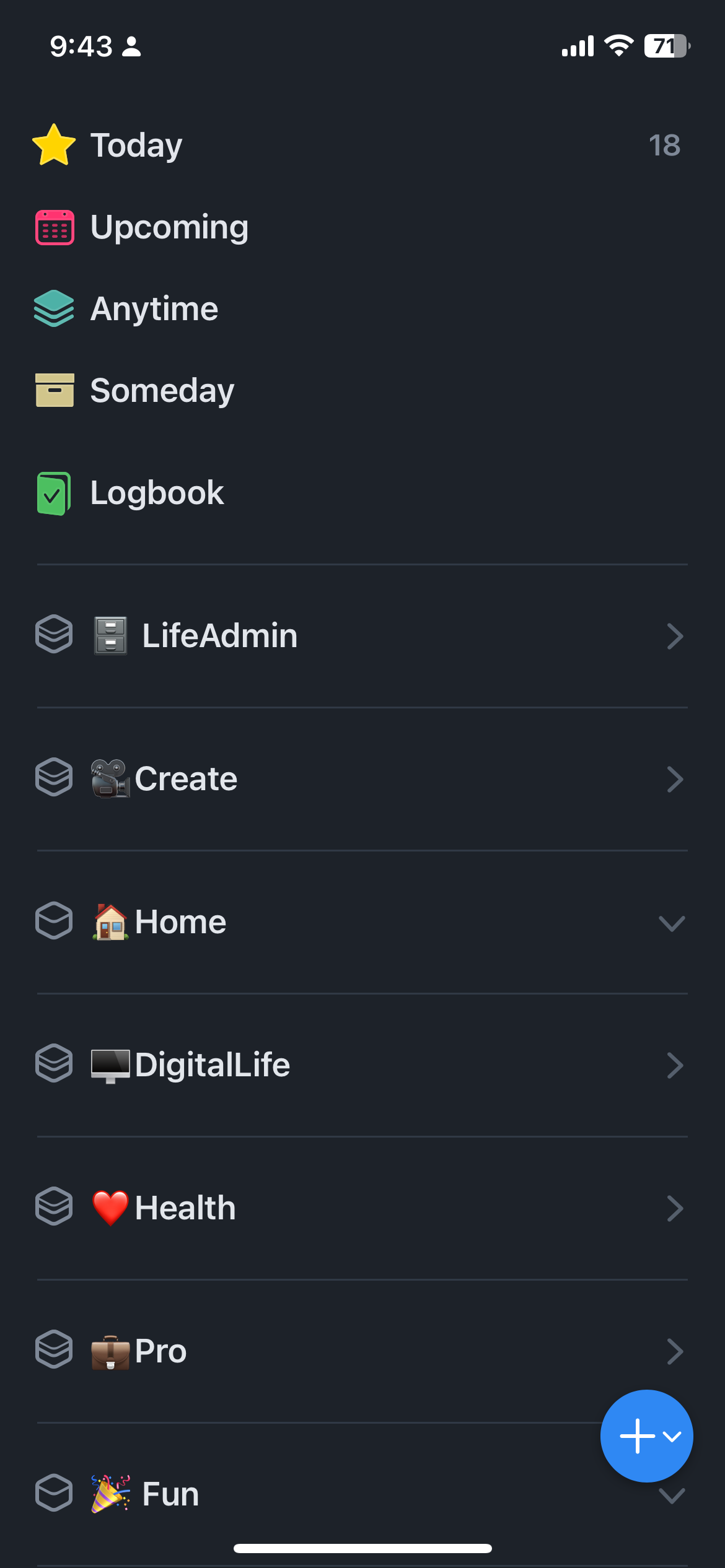
One of the first things you’ll encounter in Things is the areas, which let you create buckets for different areas of your life. Immediately, most people jump in and create areas for every part of their lives, and feel good when nothing is left out. What I found was that having too many areas became too much, and made the simple tool more complicated than it should be.
Over time, I realized that you need the minimum number of areas possible. Ideally, I wouldn’t have more areas than can fit on a single screen’s length, so you can see them at a glance. Another good tip is that you want the areas pretty evenly balanced, if one area is completely over flowing with tasks, you might want to break it down into smaller areas. If other areas are rarely getting used, you want to merge them together with another area.

Clean today view
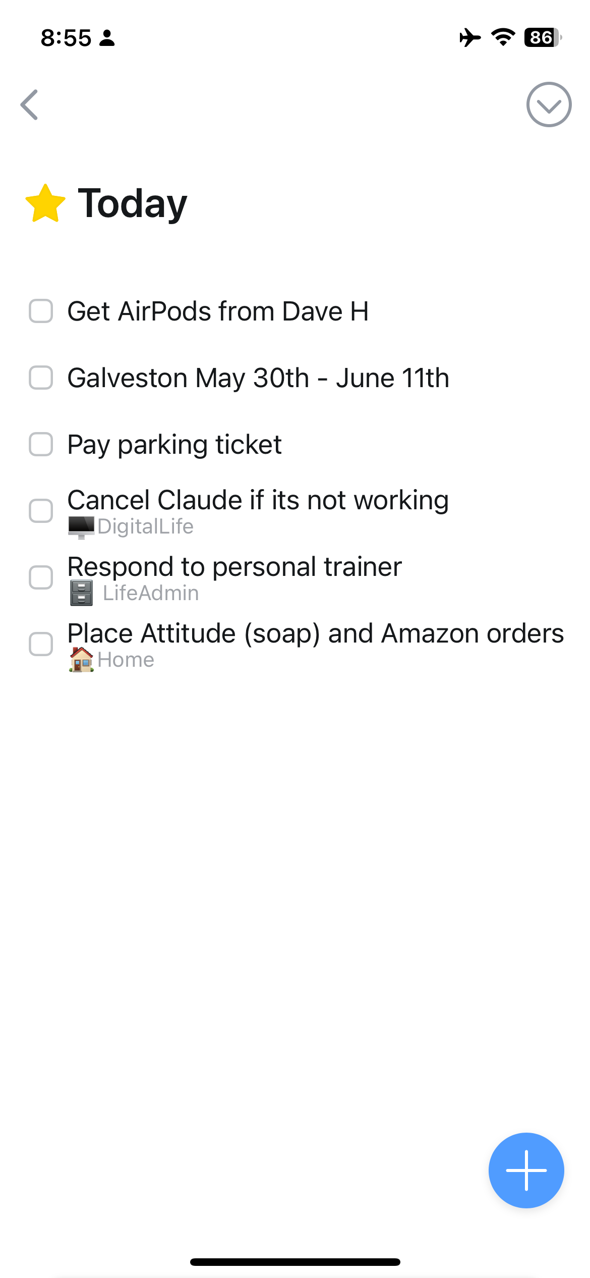
The power of Things rests in its today view. If you set it up correctly, it can focus you and be highly motivating. The mistake I made was “over using it” by putting in far too many tasks, rendering the Today view unusable.
Be extremely selective. Only put things in Today that you have a very high chance of getting done today. Do not get overly optimistic with your today view by putting in too many tasks. If you have to, start by setting a limit, I have a hard time getting more than 4–5 things done in a peak day.
The other trap to avoid is using the Today view as a place to put important tasks that you want to make sure you don’t forget. Sure, you won’t forget them because they’re in the Today view, and you’ll see them every day, but those tasks will then drag down your whole system.

Last, I make sure not to break my today view down into areas (it's a setting in the preferences). When I started out, I organized the today view by category, and as a result of the structure, I found myself putting more tasks in there than I could ever possibly do. When I got rid of showing the areas, it forced me to be more selective about what went into the today view.
Daily review
This one sounds so obvious in hindsight, but if you were going to use the "today" functionality, you do need to do a daily review to figure out what tasks are going to go there. Maybe some of you can predict that days or weeks in advance, but I never could.
My use of the Today view, and thus my productivity went way up when I set aside 10 minutes every morning to identify 6–8 tasks (max) that I was going to do that day. The more conservative I was, the more effective I was because I’d get through all the tasks, and it would motivate me more for the next day.
I still don’t do a weekly review. I found that at other points in the week, I check into each area and just drag the next highest priority task to the top of the list. This makes my daily review easier and faster.
Use the Inbox or Areas
I got lazy and started to use the Today section for my inbox. It worked for a bit, but then eventually just cluttered the Today view and made it less effective.
The inbox is a great way to capture things, and it's easy to clear it out as part of your daily review. On the Mac, the quick entry functionality helps capture things quickly as they come up, but I haven’t figured out any good shortcuts on the iPhone or iPad.
If the inbox is too many steps, then just create your tasks directly in the correct Area.
Skip tags
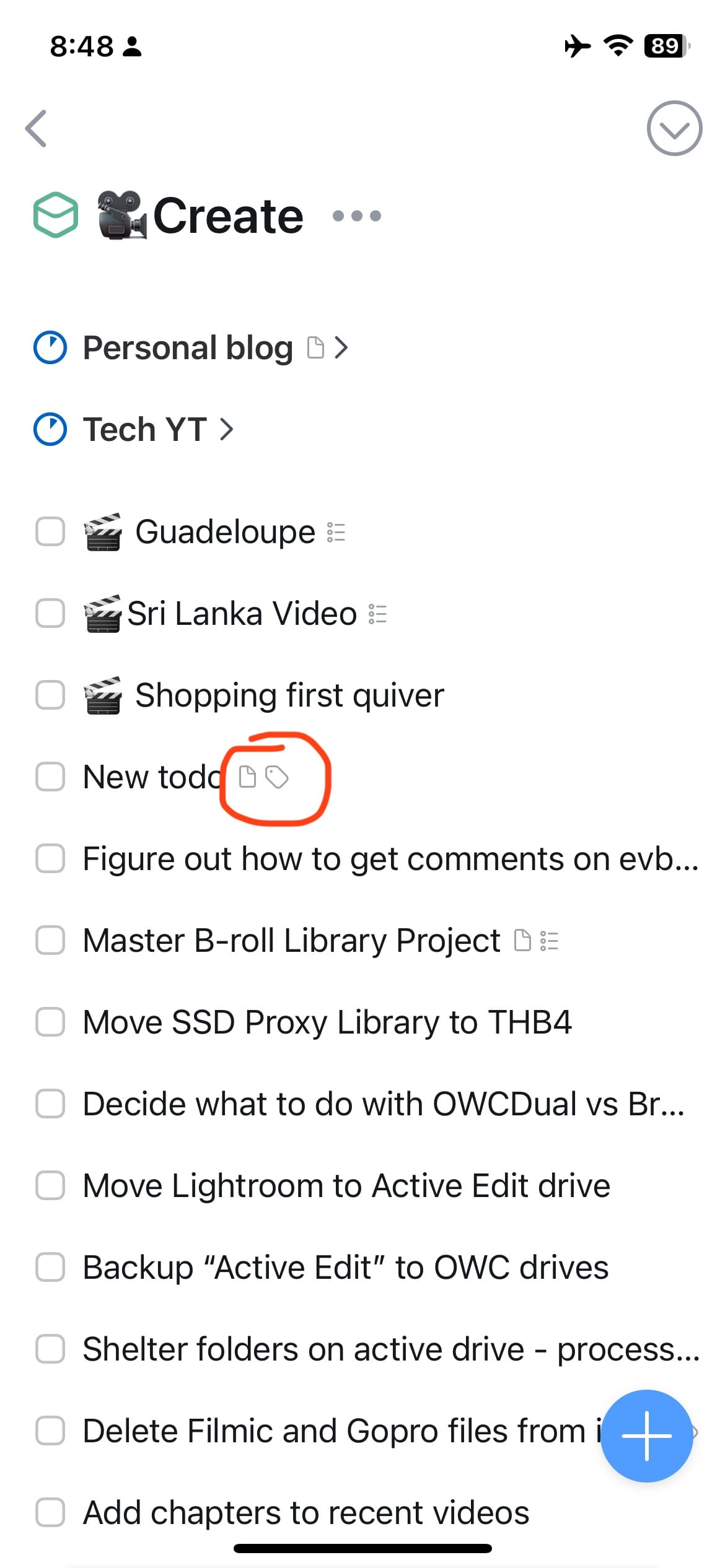
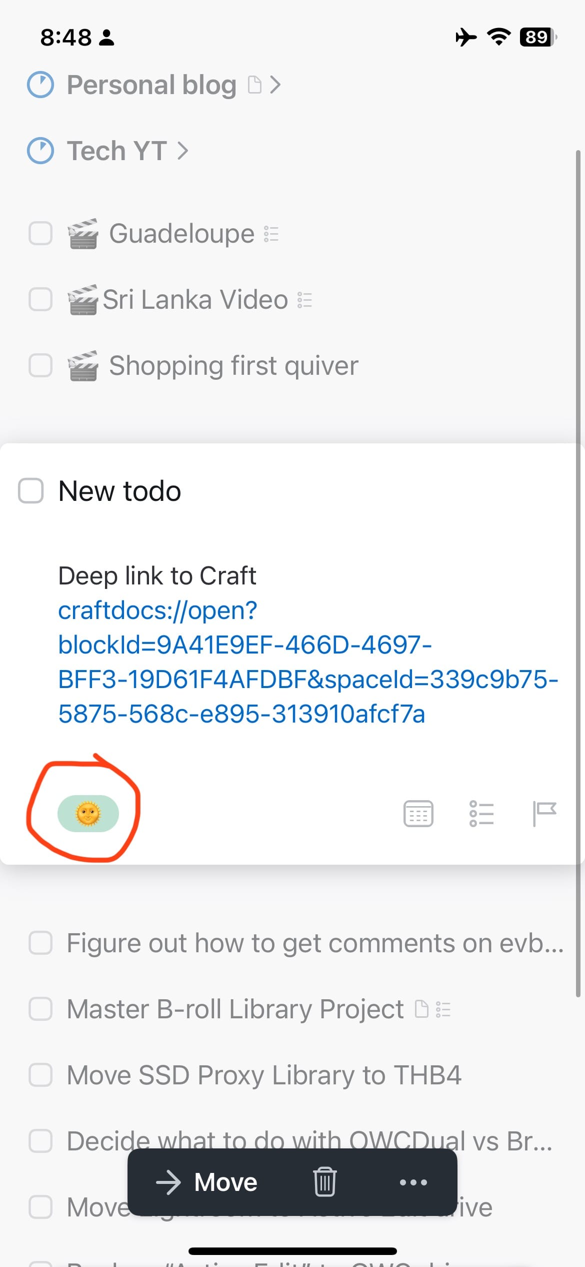
Last, I tried using tags for my system for years, and it just never did much for me except slow things down. I think one of the few big flaws of Things 3 is its tag implementation on mobile. The issue is that you cannot easily see what tag a task has in the default areas view on mobile. You see a tag icon indicating that the task as a tag, but you don’t see which tag it is, which is really frustrating.


My suggestion is to just skip using tags, or keep them to a minimum.
Conclusion
So there you have it, those are the 5 most important tips for getting Things 3 to really work for you. The key theme through all of this is not over doing it, and keeping things simple. This allows the “today” function to shine, and for you to have a single layer focused place took when you want to start getting things done for the day.